Test Analytics helps to analyze, measure, and improve your recruitment funnel with the right data points.
Overview
Test Analytics is all about presenting the intelligence in your recruitment data in a non-complicated, easy-to-understand way. Recruiters and hiring managers are often seen scrambling to create reports that accurately showcase important metrics such as:
- Invite to appear ratio: the number of test invitations - sent, clicked, opened.
- Test performance: average percentage, section performance, average test duration
- Question insights: percentage of easy questions, medium, and hard based on candidate performance
With iMocha's Test Analytics, recruitment teams can get this data in a few clicks and optimize your assessment process. The Test Analytics will help you:
- Derive intelligence from your recruitment data, right from test invites to candidate feedback.
- Track multiple metrics with granular insights to improve test calibration
- Create a well-balanced test to attract, assess, and hire the best candidates
How does Test Analytics work?
Test Analytics will give you the data for all tests conducted after Jan 1st, 2021. There are three components to Test Analytics.
Watch the below video to see how Test Analytics works.
Let's go through each one.
1. Candidate Response: The most critical element of your assessment process is the candidate. iMocha's Candidate Response metric helps you thoroughly analyse the candidate's journey from invitation to test attempt. The candidate response score is calculated as, for example, if 100 invites are sent, and 70 candidates appear for the test, the candidate response score is 70%.
Candidate Response has the below metrics:
|
Invitation Pipeline The invitation pipeline provides a snapshot of the email invitation metrics. You can view the number of invitations sent, delivered, opened, clicked, tests that appeared and completed.
How does it help? Viewing the invitation funnel helps to identify any issues and plug the gaps. For. e.g., If 100 candidates open the email and only 30 out of them click on the test link, it may mean that your email content has scope for improvement. It can be more intriguing and interesting. (You can also read our article about using our intuitive email templates here.) Note: This will only track email invites. If the email is opened and the test link is copied into the browser, it will not be tracked in the Test Links Clicked. In this case, Test Appeared numbers could be higher than the Test Links Clicked. |
|
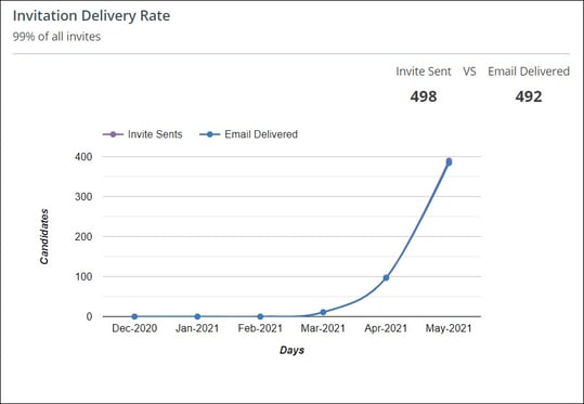
Invitation Delivery Rate The invitation delivery rate highlights the number of invitations sent and their delivery status.
How does it help? If you are constantly worried about whether your invites are getting lost in the milieu, this metric can throw light on it. A huge disparity between the sent and delivered ratio means that majority of your candidates are not getting your emails. Your IT team and service provider can help resolve this issue. |
|
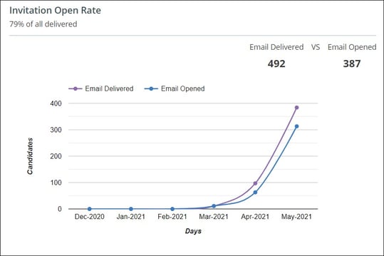
Invitation Open Rate This highlights the percentage of emails opened against the total number of emails sent.
How does it help? One area recruiters and hiring managers get worried about is the invite opening rate. Unopened emails indicate that you have that much lesser talent pool to consider. You can try changing the email content or subject line, enticing candidates to open and attempt the test. You can also see which days or months have the highest open rates. |
|
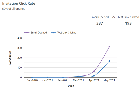
Invitation Click Rate This shows the ratio of how many test links were clicked when the emails were opened.
How does it help? You can identify why the candidates not taking the test after opening the emails. There could be factors such as the test is too lengthy, has too many sections, or very little time. |
|
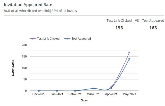
Invitation Appeared Rate This displays the percentage of candidates who started the test after receiving the test link.
How does it help? You can keep track of the percentage of candidates that appear and complete the test. If a large percentage of candidates do not complete the test, you can make changes to the test. |
2. Assessment Quality: Assessment Quality takes a deep dive into how the assessment has performed. What areas require improvement, what's working nicely for you, and what should you pay more attention to.
Assessment Quality has the below metrics:
|
Candidate Pipeline It's a funnel vision of your test invites - invitation mode, test attempts, and test completion.
How does it help? The test invite date is accessible in one glance. You know which channels of test invite (email, open URL, API) work for you. The percentage of candidates that attempt the test and further complete the test. |
|
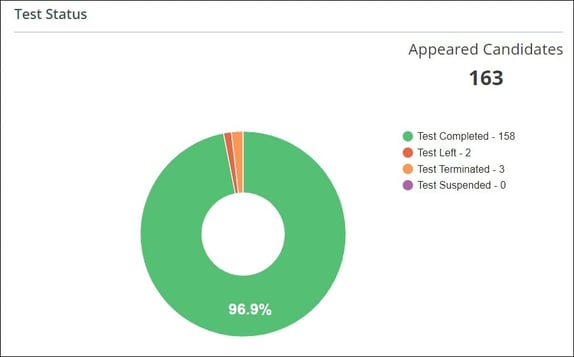
Test Status This will reflect the various test stages and the percentage of candidates in each stage.
How does it help? You can plug any gaps in the assessments, which may be due to the following reasons:
The Recruiter can always give the candidates a second chance by allowing Test Re-attempt if the above reasons seem misjudged. |
|
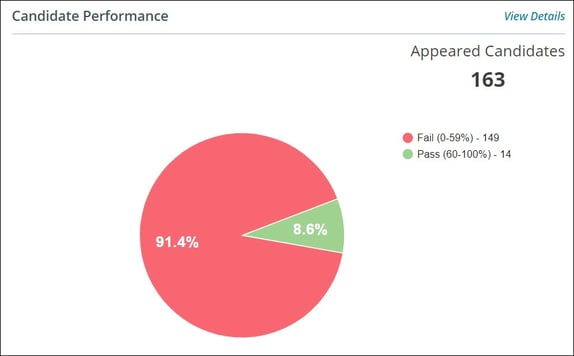
Candidate Performance This will give an overview of how the candidates have performed in the test. (Note: The grading categories set by the test admin will be reflected here.
How does it help? This will help in measuring the effectiveness of your candidate pool. If the majority of the candidates cannot clear the test or are graded in the beginner or intermediate category, they are probably finding the test difficult. You can tweak the test accordingly. |
|
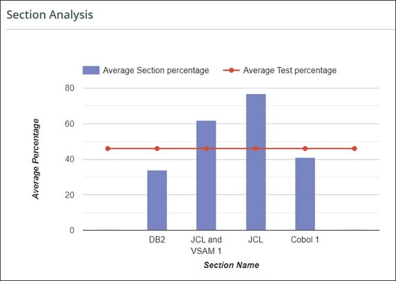
Section Analysis Know which section is doing well and which section can be improved. The average section scores and test scores also indicate the quality of candidates.
How does it help?
Suppose all the above points seem okay, then great! You got yourself an awesome Test! |
|
Score Distribution This graph helps to fish out a set of candidates scoring close to the average marks from a pool of appeared candidates. By calculating the Mean and Standard Deviation on the candidates' data using a formula, we can indicate how many candidates have scored nearer to the average score (forming a bell in the graph).
How does it help? You can adjust your test composition by looking at the data of the bell curve. If the bell is skewed towards the right side of the graph, the test seems more than healthy as the candidates score too well. If the bell is skewed towards the left side of the graph, it seems like an alarming situation as the candidates do not score that well. |
|
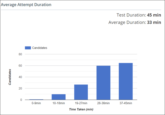
Average Attempt Duration This indicates the average time required by the candidates to complete the test.
How does it help? You can set the test composition based on this metric. For example, if most of the candidates are completing the test in less than half the time, maybe it indicates the test is easy and vice versa. |
|
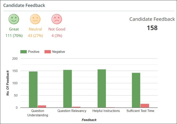
Candidate Feedback Know your candidate's real-time experience through these 3 emoticons and work on the test composition to increase the count of the green smileys.
|
3. Question Insights
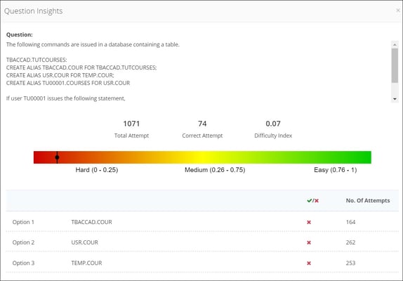
Question Insights help in analyzing the test composition highlighting the key metrics for each question. This can then be further used to modify the test composition.

Question Insights help the test creators to analyze how their selected question has performed with the candidates. E.g., if you have marked a question with easy difficulty and the actual analysis reveals the difficulty level as medium, the question needs to be changed.
How does it help?
Question Insights is exclusive analytics provided at a granular level to know each question's candidates' performance. For example, comparing the assigned difficulty level to the question versus the difficulty Index obtained by ML algorithms run over a wide data set of candidates' test attempts gives a clear picture of difficulty for a single test.
This analytics helps in analyzing the sourcing as well as the performance for every question asked.
In case of any queries, write to us at support@imocha.io

.jpg?width=574&name=Candidate%20Pipeline%20(1).jpg)
